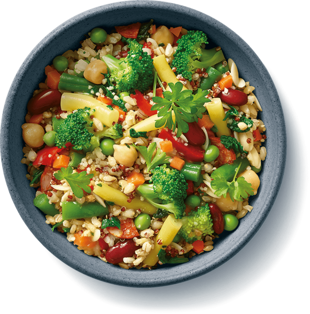
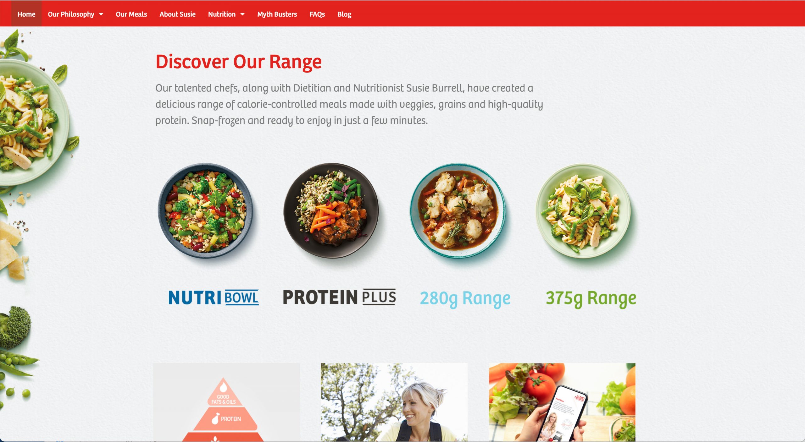
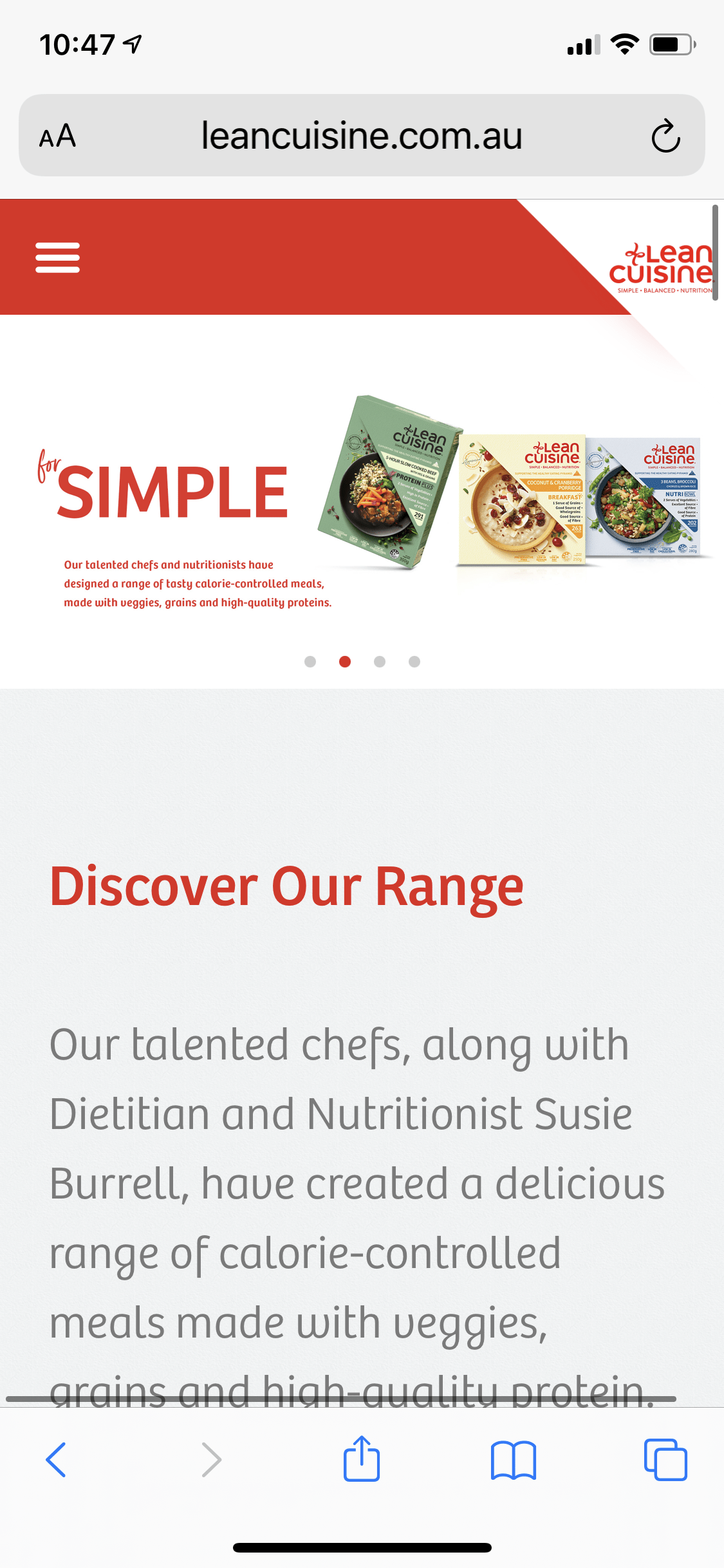
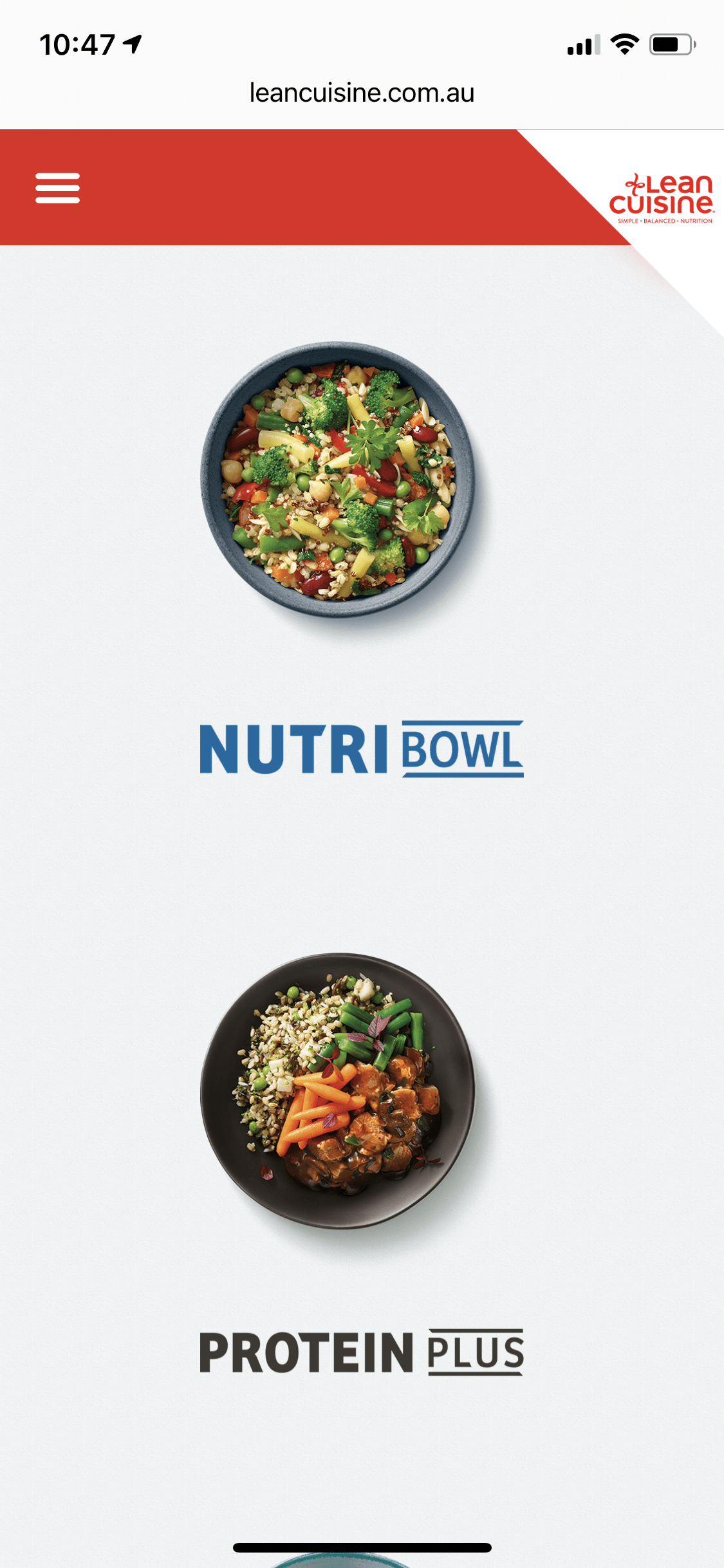
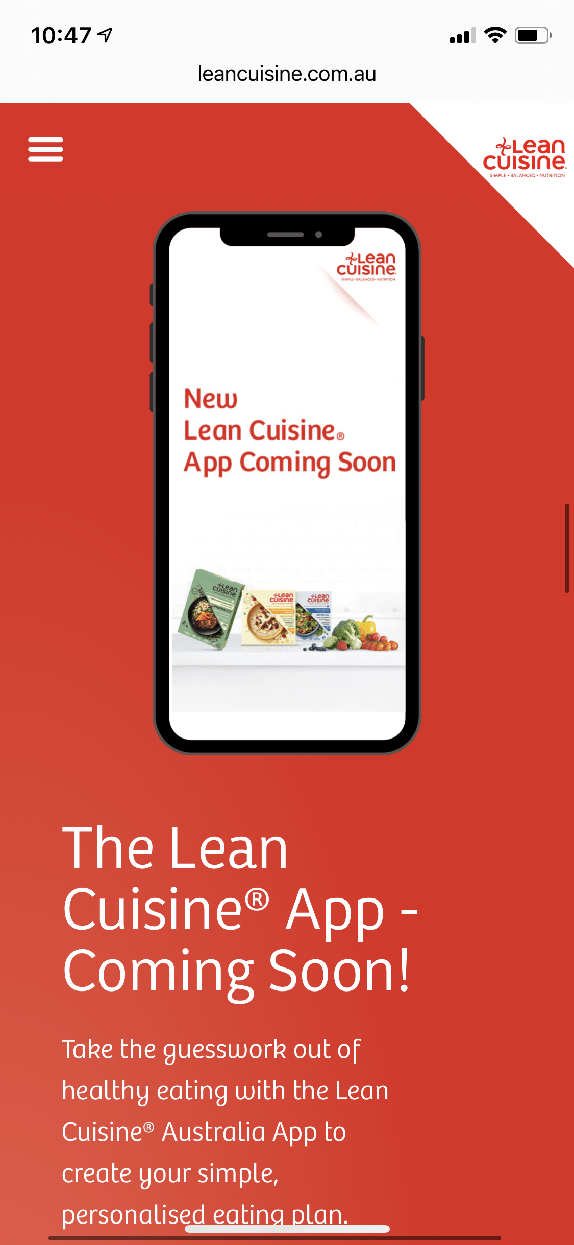
The company went through a rebrand for it’s new Simple, Balanced, Nutrition campaign which required a website redesign and development to ensure there was cohesive and consistent messaging and imagery throughout. The website had to ensure ease of use and communicate the brand’s new dietary tool, the Healthy Eating App. As Lean Cuisine released a new range of meals, we had to create an easy to find meal page which ensures any user can find the meal they are looking for and know where to purchase it from.
We worked closely with their team of designers to ensure the right design was created with the correct UX Strategy. The design incorporated stunning high grade products shots and assets which were used across the website to give it a fresh, vibrant and highly engaging look and feel. We made sure that load times were kept to the highest possible standard, applying forms of lossless compression across all devices, due to the majority of the traffic being on mobile, which also meant a “mobile first” approach to the design and ux.
